Mini-Activity Two, Art + History: "Artist Trading Cards"
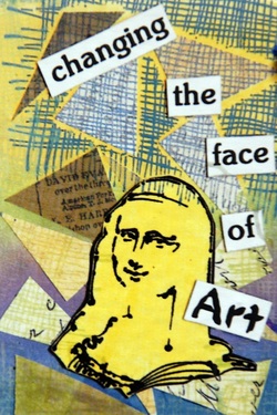
Artist Trading Cards
Grade Level: 10 & 11
Length: Two 45-minute class periods
Theme Concept(s): Distinguish differences between foreground, midground and background and develop an understanding of the effects of images placed in each. Understand that pattern can be constructed from the combined use of the principles of design.
Art History, Art Criticism, Aesthetics: Roy Lichtenstein’s works include pattern created from the principles of design- Ben day dots. Can an image be made of just patterns? Is it still a good work of art? What lines and shapes do you see what role do colors play in this work?
Art Production Concept(s): Value, foreground-midground-background, use of repeating pattern formed from the principles of design, depth and space.
Teaching Strategies: Introduction, Discussion, Demonstration, Individual Art Production.
Creative & Critical Behaviors Students Enhance: Students will be able to identify foreground, midground and background. They will develop a greater understanding of image placement in particular grounds. Students will recall principles of design and apply them to pattern making. They will also analyze and interpret works of art.
NJCCCS (one visual arts and one non-arts):
Visual Arts-1.1.12.D.1- Distinguish innovative applications of elements of art and principles of design in visual artworks.
Math-4.2.12.A.3- Apply the properties of geometric shapes (i.e. parallel lines).
Materials: Pre-cut 2”x3” heavy weight paper for Artist Trading Cards, pre-mixed gesso, magazines, scissors, glue, variety of pencils 6H-6B, scrap paper for thumbnails, images for discussion, examples of Roy Lichtenstein’s work, self-reflection worksheet.
INSTRUCTIONS:
This lesson will be the influence for the creation of your Artist Trading Card.
We’re going to do a lesson based on foreground, middle ground and background that will be the influence for the creation of your Artist Trading Card.
DAY 1/2:
INTRODUCTION: I’m going to place in you groups and I want you to discuss your image and figure out which part of the image are the foreground, middle ground and background. See if you can come up with a few adjectives to describe each ground that support your answers.


After everyone goes we’ll discuss the actual definition and go back to any groups we had questions on. Have each group present their findings. Chart the adjectives used to describe each ground on the board.
DISCUSSION: (Point to each area as you explain it) So, foreground is what appears closest to
you and usually has the most detail. Background is the complete opposite. It’s furthest away from the viewer, and also has the least amount of detail. Midground is between those two areas and has some detail. Does anyone have any questions?
What do you notice about the images in the background and their size or detail compared to images in the foreground? They’re smaller the further away they are, along with less detail.
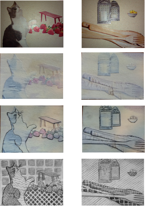
DEMONSTRATION: We’re going to make an Artist Trading Card that demonstrates depth and space by using our knowledge of foreground, midground and background. Remember that foreground will be the part of the image or object closest to the viewer; it will also be largest and have the most detail. The background will be the image furthest away, smallest, and have the least amount of detail. The midground will fall in between these two and have some detail. I’ll be passing out a
checklist/self-evaluation that will list all of the qualities so you can check your work as you create.
Pass around images in a sandwich bag for students to see. I have here a few images I cut out of a magazine as examples. I recommend you cut out more than you need in case some don’t work out. I have 3 small images and 3 large. Since our ATC are smaller, we’ll be picking one large image for the foreground and one small image for the middle ground. For the background you can draw your image since it will be too tedious to cut out an image that small.
Here’s another idea. If you see an image you like but it’s too large, here is a way to crop it. Show students how to place image on ATC if they want to use cropping method.
After you have your two images you’ll be using, I want you to get a piece of tracing paper
and create 3 compositions that you might use for your card. You’ll also have to draw your background image into each of these. Show class sample of tracing paper with three compositions I created.
Show me before you glue the images down. You will need to trace what lines you think are most important for the viewer to be able to understand what the image is. Make sure your compositions include all the contour lines and detail needed for you to remember what the image looks like because after we brush gesso over it you might not be able to see all the detail. Pass out self-evaluation checklist. Make sure you can check off all items on your self-evaluation checklist to ensure you have the correct amounts of detail in your compositions!
Next you’ll glue down the images into the composition we agreed on. Take a picture of it if you can so you see all the detail- but your tracing paper composition should also give you clues to the detail since you made sure to include as many contour lines as you needed. Last brush a thin layer of gesso over it.
End of Day 1/2_______________________________________________________________________
Day 3/4:
Can an image be made of just pattern be considered good art?
DISCUSSION: (Point to each area as you explain it) So, foreground is what appears closest to
you and usually has the most detail. Background is the complete opposite. It’s furthest away from the viewer, and also has the least amount of detail. Midground is between those two areas and has some detail. Does anyone have any questions?
What do you notice about the images in the background and their size or detail compared to images in the foreground? They’re smaller the further away they are, along with less detail.
DEMONSTRATION: We’re going to make an Artist Trading Card that demonstrates depth and space by using our knowledge of foreground, midground and background. Remember that foreground will be the part of the image or object closest to the viewer; it will also be largest and have the most detail. The background will be the image furthest away, smallest, and have the least amount of detail. The midground will fall in between these two and have some detail. I’ll be passing out a
checklist/self-evaluation that will list all of the qualities so you can check your work as you create.
Pass around images in a sandwich bag for students to see. I have here a few images I cut out of a magazine as examples. I recommend you cut out more than you need in case some don’t work out. I have 3 small images and 3 large. Since our ATC are smaller, we’ll be picking one large image for the foreground and one small image for the middle ground. For the background you can draw your image since it will be too tedious to cut out an image that small.
Here’s another idea. If you see an image you like but it’s too large, here is a way to crop it. Show students how to place image on ATC if they want to use cropping method.
After you have your two images you’ll be using, I want you to get a piece of tracing paper
and create 3 compositions that you might use for your card. You’ll also have to draw your background image into each of these. Show class sample of tracing paper with three compositions I created.
Show me before you glue the images down. You will need to trace what lines you think are most important for the viewer to be able to understand what the image is. Make sure your compositions include all the contour lines and detail needed for you to remember what the image looks like because after we brush gesso over it you might not be able to see all the detail. Pass out self-evaluation checklist. Make sure you can check off all items on your self-evaluation checklist to ensure you have the correct amounts of detail in your compositions!
Next you’ll glue down the images into the composition we agreed on. Take a picture of it if you can so you see all the detail- but your tracing paper composition should also give you clues to the detail since you made sure to include as many contour lines as you needed. Last brush a thin layer of gesso over it.
End of Day 1/2_______________________________________________________________________
Day 3/4:
Can an image be made of just pattern be considered good art?
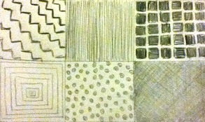
After discussing question: I’ll be handing you out a piece of sketching paper. I want you to fold it into 6 sections, and in each box, create a different pattern. Think about patterns using lines, shapes or even both. Think about keeping lines parallel and repeating them to create an illusion of movement. Think about repeating shapes, super small and close together or really large and far apart. It will be black and white so you can even think about value. You can use one pattern and vary the values, or all of your patterns in different grounds. Keep in mind value, which items do you want to be light, which will be dark? Use the second rubric, for patterns, to keep you on track. After you turn in your 6 patterns finish up tracing your compositions, gluing, and brushing gesso on your ATC card.
Art History- Roy Lichtenstein
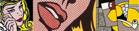
Anyway, our inspiration will draw upon your previous contour line project and artist Roy Lichtenstein. Has anyone heard of him or seen his work? Show images of his work and point out the Ben day dots.
His work doesn’t have very distinct/variety of grounds but were going to focus on his patterns and contour lines. He uses the Ben day dots to ‘color’ his images. Notice how he picks out certain contour lines to show the viewer the basic outline of the image. You will use your 6 patterns you created earlier to refer back to when you start to fill in your contours on your Artist Trading Cards. Remember to consider value, pattern size and shape so you can still distinguish the foreground, middle ground and background on your Artist Trading Cards. How will using value help distinguish between the two images? Make sure you vary the patterns from item to item somehow so we can tell them apart. Maybe a smaller, darker pattern in the background will help contrast against a lighter larger pattern in the front.
Show example of a card that doesn’t vary pattern shape, size or value.
Worksheets below:
SELF-EVALUATION RUBRIC
Name:________________________________ Date:________________
Checklist:
Images in the foreground:
-Are closest to the viewer/
at the front of the picture plane. oYes or oNo
-Have the most detail/lines. oYes or oNo
-Are largest in size. oYes or oNo
Images in the midground:
-Are located in the middle/
behind the images in the foreground, oYes or oNo
and in front of the background.
-Have some detail/lines. oYes or oNo
-Are medium in size/ smaller than
the images in the foreground, oYes or oNo
and larger than images in the
background.
Images in the background (if applicable):
-Are located behind images in
the midground and foreground. oYes or oNo
-Have the least amount of detail/lines. oYes or oNo
-Are the smallest in size. oYes or oNo
If all can be answered as “Yes” you’ve demonstrated a strong understanding in foreground, midground and background and have completed the activity. If some questions were answered “No” use this rubric to go back and make corrections to your work. See me for questions, comments or concerns.
Samples